What Is a Relative Rotation Graph (RRG)?
In an ever-evolving market, knowing where to focus your capital is just as important as knowing when to enter or exit a trade. The Relative Rotation Graph (RRG) is a powerful visual tool designed to simplify sector and asset rotation analysis. Unlike traditional charts that show individual performance, RRG allows traders and investors to compare relative strength and momentum of multiple instruments against a benchmark—all in one compact visualization.
Initially developed by Julius de Kempenaer, RRGs have gained popularity among institutional and retail traders alike for identifying sector leadership, spotting early signs of rotation, and making more data-driven portfolio decisions.
🧩 Understanding the Components of an RRG Chart
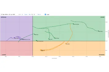
An RRG consists of multiple key components that work together to show how different sectors or stocks are rotating relative to a benchmark (like Nifty 50, S&P 500, etc.).
✅ 1. Four Quadrants
The graph is divided into four distinct quadrants, each representing a different stage in the performance cycle:
- Leading (Top Right): Instruments here show both strong momentum and relative strength. These are often outperformers and potential trend leaders.
- Weakening (Bottom Right): Still strong on relative strength but losing momentum. A potential sign of exhaustion.
- Lagging (Bottom Left): Sectors/stocks underperforming both in strength and momentum. Often best to avoid or short.
- Improving (Top Left): Momentum is picking up while strength is still below the benchmark. These are early-stage candidates for potential leadership.
✅ 2. Tails (Trails of Rotation)
Each instrument leaves behind a trail as it moves through these quadrants over time. The length and curvature of these tails indicate the speed and direction of momentum shifts.
✅ 3. Benchmark Asset
All comparisons are made relative to a selected benchmark index. This ensures that the focus is on relative—not absolute—performance, helping you identify outperformers and underperformers in a meaningful way.
🧠 Practical Application: How to Use RRG in Trading and Investing
RRGs are not just for passive observation—they can be actively used to enhance portfolio strategy, sector rotation, and trade selection. Here’s how to apply them effectively:
🧭 1. Identify Sector Leadership
Start by plotting all major sectors of the market (like Nifty sectors or S&P sectors) against the benchmark index. Sectors in the Leading quadrant are prime candidates for long positions.
🔄 2. Monitor Sector Rotation
As sectors move from one quadrant to another, they provide cues about shifts in market leadership. For example:
- A sector moving from Improving → Leading shows early momentum confirmation.
- A transition from Leading → Weakening → Lagging might signal an exit or short opportunity.
📊 3. Filter Strong Stocks Within Leading Sectors
Once strong sectors are identified, you can zoom into those and use relative strength analysis to pick individual stocks within those sectors that are outperforming their peers.This will also take into account the stock prices today.
🧩 4. Combine with Fundamentals and Technicals
RRG is most effective when used alongside:
- Fundamental filters (earnings growth, ROE, etc.)
- Technical confirmation (chart structure, price patterns, breakouts)
This multi-dimensional approach improves decision-making and increases conviction in both short-term trades and long-term investments.
Conclusion
The Relative Rotation Graph is more than just a visual gimmick—it’s a strategic lens into market behavior. It helps you stop chasing trends blindly and start rotating with institutional flows. Whether you’re an active trader or a long-term investor, RRG can guide your attention to the strongest pockets of the market and help you stay ahead of the curve. Mastering its use can significantly enhance your ability to ride trends early, avoid laggards, and optimize portfolio performance in any market environment.
